I know. It's supposed to be all about my students. I'm supposed to say something about helping them focus on learning versus work completion or helping them learn to self-assess or whatever. Yeah. That's all true. But even if that wasn't true, even if standards-based grading was no better at that stuff than traditional grading, I'd still do it.
Why? Because I know of no better way to inform me about what I need to do next. I need to know what I can do to help get a kid from point A to point B. Getting 90% on a Chapter 14 quiz or a B+ on Worksheet 1.6 won't tell me that. I need to be able to tell a student, not that he's failing, but that while he gets how to calculate the average speed of an object, he's still struggling with graphing that motion and here's something that will help.
And I need to be able to do it quickly.
Pre-SBG, I'd have needed to open up a packet of work (that's assuming I still had it or that he still kept it), flipped through each page, and then prayed that some sort of recurring pattern jumped out at me. Even if by some miracle that worked, I'd have NEVER done that for every kid on my own. It's just too much work. I would wait until a student took the initiative to actually ask me what he or she was struggling with. I'm sure I justified it as "helping students take responsibility for their own learning." Because, you know, after a student has spent her whole life getting Fs in everything, my F is the magic one that bestows upon her the gift of knowing how to respond to failure. It's like the Triforce. Now that she's collected all of those Fs she can now wish herself into being an A student.
So here's my advice for those of you who are working on standards-based grading for the summer: As you're setting things up, look at each piece and you should ask yourself, "Do I know how to respond? If I look at this, can I determine what to do next?"
When you're setting things up (or revising them) think of everything you're doing as a bunch of If-Then statements. On an assessment, if this happens, then this should happen. In my gradebook, if I see this, then I should do this. The strength of standards-based grading isn't that it gives you better information, it's that it gives you better direction.
Bonus Power User tip: Take a single question, a full quiz, your Do Now or whatever. Write out a bunch of If-Then statements. Depending on the type of assessment it might look like this - "If you miss #3, then..." or "If you get a 2, then..." or "If you answered 8 m/s, then....." Give the assessment, correct it in class right away in whatever manner you prefer, and then put up the If-Then statements on the board.
Friday, June 17, 2011


Friday, May 13, 2011
Upcoming Events: GPD and EdCampSFBay
Two cool things coming up:
Global Physics Department
I should have blogged about this earlier. Every Wednesday at 9:30 Eastern, there is an elluminate session to discuss various topics in physics education. There have been slightly more than 20 participants each week. I've got dinner/family time then so I can never make it live. Luckily, all the sessions are recorded.
Next week (May 18) Brian Frank will be discussing how to build on student misconceptions (His title: The wrong ideas I love my students to have, and the right ideas I worry about). He's got a bunch of really good posts on misconceptions. In this post, Brian links a John Clement paper on bridging misconceptions that is FANTASTIC.
Normally you can just show up. But the following week SEAN (OMG I'm geeking out!) CARROLL is going to host it. Due to space limitations, you'll need to register here.
The perma-link for the elluminate sessions are http://tinyurl.com/RundquistOfficeHours
EdCampSFBay
When: Saturday, August 20 8-4
Where: Skyline High School, Oakland
If you don't know what an EdCamp is, hit the link and watch the video.
You can follow @EdCampSFBay for updates.
I'm definitely planning to be there so say hello if you see me. And no, I don't plan to run a session.
Global Physics Department
I should have blogged about this earlier. Every Wednesday at 9:30 Eastern, there is an elluminate session to discuss various topics in physics education. There have been slightly more than 20 participants each week. I've got dinner/family time then so I can never make it live. Luckily, all the sessions are recorded.
Next week (May 18) Brian Frank will be discussing how to build on student misconceptions (His title: The wrong ideas I love my students to have, and the right ideas I worry about). He's got a bunch of really good posts on misconceptions. In this post, Brian links a John Clement paper on bridging misconceptions that is FANTASTIC.
Normally you can just show up. But the following week SEAN (OMG I'm geeking out!) CARROLL is going to host it. Due to space limitations, you'll need to register here.
The perma-link for the elluminate sessions are http://tinyurl.com/RundquistOfficeHours
EdCampSFBay
When: Saturday, August 20 8-4
Where: Skyline High School, Oakland
If you don't know what an EdCamp is, hit the link and watch the video.
You can follow @EdCampSFBay for updates.
I'm definitely planning to be there so say hello if you see me. And no, I don't plan to run a session.
Tuesday, May 10, 2011
Formulating Measures
Back to assessment! Not technically research so it's not getting the edresearch tag.
I found this via Sarah Cannon who blogs at Sarah's Development. The full paper was written by Judah Schwartz and can be found on his old Harvard page. This work came from the Balanced Assessment in Mathematics project.
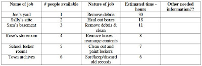
The sample prompt is really all you need to figure out what's going on here:
 If you can't read the questions, they are:
On page 10, the author lists the proposed components in formulating a measure.
Other than the very obvious ones (formulating a measure for speed or for density) I fully admit to slacking on this.
1: Did you start with (Horizontal/Vertical) with "most square" being closest to 1 as your first measure of square-ness? I did. But Schwartz pointed out that the measure then changes if you rotate the figure 90 degrees. Should this occur for a measure of square-ness? Great great GREAT conversation fodder.
I found this via Sarah Cannon who blogs at Sarah's Development. The full paper was written by Judah Schwartz and can be found on his old Harvard page. This work came from the Balanced Assessment in Mathematics project.
The sample prompt is really all you need to figure out what's going on here:

- Which of the rectangles is the "squarest"?
- Arrange the rectangles in order of "square-ness" from most to least square.
- Devise a measure of "square-ness," expressed algebraically, that allows you to order any collection of rectangles in order of "squareness."
- Devise a second measure of "square-ness" and discuss the advantages and disadvantages of each of your measures.1
I love these -ness problems. There is a ton of high level thinking here and the formulation of measures is the first step in model building. One of my ongoing struggles is helping my students become more precise with their language. What does, ".....works better," mean?
I know the paper says, "Please do not quote," at the top, but I'm going to ignore that:
I know the paper says, "Please do not quote," at the top, but I'm going to ignore that:
Formulating a measure requires one to be explicit about the constituent elements of data that one believes are important in a given situation. (p. 2)Standard measures included rates, ratios and area. Non-standard measures that were listed included crowded-ness, sharp-ness (as in curves), disc-ness (of cylinders) and developing a "size of task" measure given this data set.

On page 10, the author lists the proposed components in formulating a measure.
- Observing
- Comparing
- Ordering
- Making Measurements
- Analyzing Data
At the end of the paper (starting on page 11), the author goes on to differentiate between measures and models (models having the ability to predict in untried instances and being falsifiable).
1: Did you start with (Horizontal/Vertical) with "most square" being closest to 1 as your first measure of square-ness? I did. But Schwartz pointed out that the measure then changes if you rotate the figure 90 degrees. Should this occur for a measure of square-ness? Great great GREAT conversation fodder.
Wednesday, May 4, 2011
Ed Research: From Studying Examples to Solving Problems
Atkinson, Renkl, Merrill: Transitioning From Studying Examples to Solving Problems: Effects of Self-Explanation Prompts and Fading Worked-Out Steps [pdf] [edit:fixed link]
I'm sharing this paper for two reasons. First, the suggested modifications require close to zero added instructional time and energy. Always a win. Second, it is a good illustration of one of the reasons I read so much research. I don't consider myself an instinctive teacher. Many of you will read this and be like, "Well.....duh." Me? Not so much. I have to put deliberate effort into improving what I do and stuff like this isn't as obvious to me (until I read it) as I'd like it to be.
Summary: The researchers combined worked examples with self-explanation prompts at each step to help facilitate far transfer.
Worked examples are something that most teachers use. They've got a low instructional cost, both in terms of time and energy. When students are working on solving problems in class, I will tape a few answer keys will the problems worked out around the room so they can check when they're done or when they're stuck. It's effective. The problem is that worked examples, while very good for near transfer (problems that are similar to the example) have been pretty disastrous for far transfer. Which totally makes sense since usually students are learning steps rather than engaging in the problem.
The researchers did two specific things to improve upon the standard work example.
Fading: The steps in the worked examples would be removed in reverse order. So the last step would be removed, followed by the second to last step, and so forth until the student did not need the examples anymore. Makes total sense but not something I normally do. My problem solving scaffolds go from the full structure (entire worked example) to being completely removed (solving independently). In an earlier study, one of the authors (Renkl) found that this worked well for near transfer but not for far. This study in the paper was designed to help remediate this problem.
Self-explanation prompts: In addition to the backward fading procedure, the authors added self-explanation prompts to each step. These were computer based examples so those prompts consisted of selecting a rule/principle from a multiple-choice set. Here's a pic from the paper:
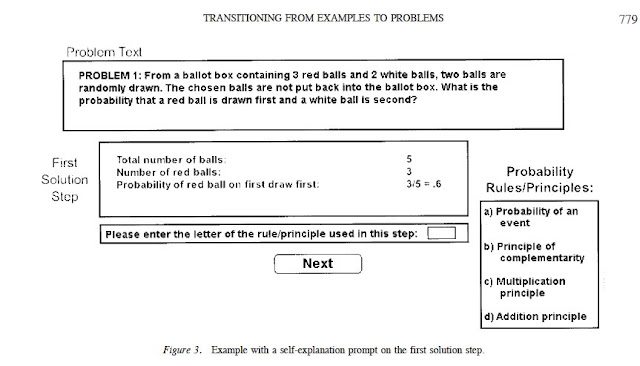
Adding this prompt increased both near transfer and far transfer when compared with just backward fading.
There's an interesting discussion at the end of the paper about cognitive load. Previous researchers found mixed results for similar treatments. The authors speculated that cognitive load may be an issue. In one study, the examples were spread out over multiple pages and in another participants were asked to type in the principles rather than just selecting them.
Cognitive load theory is interesting but often misapplied. But that's a post for another day.
I'm sharing this paper for two reasons. First, the suggested modifications require close to zero added instructional time and energy. Always a win. Second, it is a good illustration of one of the reasons I read so much research. I don't consider myself an instinctive teacher. Many of you will read this and be like, "Well.....duh." Me? Not so much. I have to put deliberate effort into improving what I do and stuff like this isn't as obvious to me (until I read it) as I'd like it to be.
Summary: The researchers combined worked examples with self-explanation prompts at each step to help facilitate far transfer.
Worked examples are something that most teachers use. They've got a low instructional cost, both in terms of time and energy. When students are working on solving problems in class, I will tape a few answer keys will the problems worked out around the room so they can check when they're done or when they're stuck. It's effective. The problem is that worked examples, while very good for near transfer (problems that are similar to the example) have been pretty disastrous for far transfer. Which totally makes sense since usually students are learning steps rather than engaging in the problem.
The researchers did two specific things to improve upon the standard work example.
Fading: The steps in the worked examples would be removed in reverse order. So the last step would be removed, followed by the second to last step, and so forth until the student did not need the examples anymore. Makes total sense but not something I normally do. My problem solving scaffolds go from the full structure (entire worked example) to being completely removed (solving independently). In an earlier study, one of the authors (Renkl) found that this worked well for near transfer but not for far. This study in the paper was designed to help remediate this problem.
Self-explanation prompts: In addition to the backward fading procedure, the authors added self-explanation prompts to each step. These were computer based examples so those prompts consisted of selecting a rule/principle from a multiple-choice set. Here's a pic from the paper:

Adding this prompt increased both near transfer and far transfer when compared with just backward fading.
There's an interesting discussion at the end of the paper about cognitive load. Previous researchers found mixed results for similar treatments. The authors speculated that cognitive load may be an issue. In one study, the examples were spread out over multiple pages and in another participants were asked to type in the principles rather than just selecting them.
Cognitive load theory is interesting but often misapplied. But that's a post for another day.
Sunday, May 1, 2011
Ed Research: IMPROVE
I'm shelving the Hattie post for now. I can't do it without it turning into a 3-part series on meta-analysis. I'm hoping if I walk away from it for a little bit I'll be able to turn it into something more concise (and coherent).
Until then, I'm changing it up. I read a lot of educational research. At least, a lot for a teacher who isn't enrolled in any grad school program. I'm going to start sharing some research I've already been incorporating and later move on to just things I've found interesting but haven't figured out how to implement.
First up: IMPROVE: A Multidimensional Method for Teaching Mathematics in Heterogeneous Classrooms
IMPROVE is an acronym created by Zemira Mevarech and Bracha Kramarski out of Bar-Ilan University in Israel and describes the method they devised for mathematics instruction. It's based on three principles: metacognitive training, learning in heterogeneous cooperative grouping, and provision of feedback-corrective enrichment.
IMPROVE stands for:
Introducing the new concepts
Metacognitive questioning
Practicing
Reviewing and reducing difficulties
Obtaining mastery
Verification
Enrichment
Sounds cheesy. I know. But I'm only going to focus on one part—metacognitive questioning. The authors drew from Polya for these but I like this structure a bit more .
For the study, Mevarech and Kramarski designed a series of questioning cards. I picture them as index cards with questions written on them but I don't have any actual examples. The questions were first used when the teacher was modeling problem solving for the class. In groups, students then took turns solving problems while answering the questions. The teacher would also circulate the class and take a turn at each group (solving problem and answering the questions along the way). Students wouldn't move on to the next problem until they reached a consensus based on discussion.
There were three categories.
Comprehension Questions - Students were asked to reflect on the problem first. They read it out loud, described the concept in their own words, and what type of problem it was.
Examples: What's the problem asking? What is it giving you? What type of problem is it? What are the essential features?
Connection Questions - Students focus on the similarities and differences between the current problem and the previous problem or problem set.
Examples: How are....and....similar? How are....and....different?
Strategic Questions - Students were asked what strategy they selected to solve the problem and for what reason.
Examples: What strategy is most appropriate? Why is this strategy most appropriate? How can the suggested plan be carried out?
The authors state that, "...students were introduced during the year to a large repertoire of strategies from which they had to select the appropriate one...." Examples given were constructing a table, drawing a diagram, and selecting the appropriate formula.
I'd love to see the selection of strategies but unfortunately they were not included.
I also have Reflection Questions (How do you know it's right? How could you have solved it differently?). I'm pretty sure the authors added this in future versions of IMPROVE but I could just be making it up.
I've been using these questions for three years now. I like having frameworks for my students to work within and if I just said, "Talk about science," I'd get many conversations about the last Chivas game and very little actual science. I don't use cards. I just put problems on the left side of a paper and leave a column on the right side for students to fill in with the answers to the metacognitive questions. They don't do them every time, just when they're working on something new. I also use them when students are planning labs.
On my part, I model them when demonstrating something and try to reference them as explicitly as possible when I'm prompting students who are stuck.
I've been happy with it although I need to work harder at having the students generate and refer back to a list of strategies.
Addendum: Talking with @park_star on Twitter she mentioned that this is how teachers in her ed program taught problem solving. So if you're in Canada, nothing new I guess. Also, I forgot to mention is that after I've worked a bit at building the habit, I've found that it's something I should only push when it's truly problem solving. The students need to be working on something difficult so that these metacognitive questions are actually useful. Otherwise it becomes just another task that's forced on them and is the metacognitive equivalent of showing your work.
Until then, I'm changing it up. I read a lot of educational research. At least, a lot for a teacher who isn't enrolled in any grad school program. I'm going to start sharing some research I've already been incorporating and later move on to just things I've found interesting but haven't figured out how to implement.
First up: IMPROVE: A Multidimensional Method for Teaching Mathematics in Heterogeneous Classrooms
IMPROVE is an acronym created by Zemira Mevarech and Bracha Kramarski out of Bar-Ilan University in Israel and describes the method they devised for mathematics instruction. It's based on three principles: metacognitive training, learning in heterogeneous cooperative grouping, and provision of feedback-corrective enrichment.
IMPROVE stands for:
Introducing the new concepts
Metacognitive questioning
Practicing
Reviewing and reducing difficulties
Obtaining mastery
Verification
Enrichment
Sounds cheesy. I know. But I'm only going to focus on one part—metacognitive questioning. The authors drew from Polya for these but I like this structure a bit more .
For the study, Mevarech and Kramarski designed a series of questioning cards. I picture them as index cards with questions written on them but I don't have any actual examples. The questions were first used when the teacher was modeling problem solving for the class. In groups, students then took turns solving problems while answering the questions. The teacher would also circulate the class and take a turn at each group (solving problem and answering the questions along the way). Students wouldn't move on to the next problem until they reached a consensus based on discussion.
There were three categories.
Comprehension Questions - Students were asked to reflect on the problem first. They read it out loud, described the concept in their own words, and what type of problem it was.
Examples: What's the problem asking? What is it giving you? What type of problem is it? What are the essential features?
Connection Questions - Students focus on the similarities and differences between the current problem and the previous problem or problem set.
Examples: How are....and....similar? How are....and....different?
Strategic Questions - Students were asked what strategy they selected to solve the problem and for what reason.
Examples: What strategy is most appropriate? Why is this strategy most appropriate? How can the suggested plan be carried out?
The authors state that, "...students were introduced during the year to a large repertoire of strategies from which they had to select the appropriate one...." Examples given were constructing a table, drawing a diagram, and selecting the appropriate formula.
I'd love to see the selection of strategies but unfortunately they were not included.
I also have Reflection Questions (How do you know it's right? How could you have solved it differently?). I'm pretty sure the authors added this in future versions of IMPROVE but I could just be making it up.
I've been using these questions for three years now. I like having frameworks for my students to work within and if I just said, "Talk about science," I'd get many conversations about the last Chivas game and very little actual science. I don't use cards. I just put problems on the left side of a paper and leave a column on the right side for students to fill in with the answers to the metacognitive questions. They don't do them every time, just when they're working on something new. I also use them when students are planning labs.
On my part, I model them when demonstrating something and try to reference them as explicitly as possible when I'm prompting students who are stuck.
I've been happy with it although I need to work harder at having the students generate and refer back to a list of strategies.
Addendum: Talking with @park_star on Twitter she mentioned that this is how teachers in her ed program taught problem solving. So if you're in Canada, nothing new I guess. Also, I forgot to mention is that after I've worked a bit at building the habit, I've found that it's something I should only push when it's truly problem solving. The students need to be working on something difficult so that these metacognitive questions are actually useful. Otherwise it becomes just another task that's forced on them and is the metacognitive equivalent of showing your work.
Saturday, April 2, 2011
Session 7: A Picture is Worth A Thousand Numbers
The whole "data is plural" thing is going to kill me. I'm going to jump back and forth and avoid using the word data by itself as much as possible. Sorry grammarians.
Main idea: Visualization helps draw out the story of data.
Things I found interesting, but not necessarily that I agree with.
Tara has a wiki here and her preso is here. For full disclosure's sake, I'll just point out that she's a friend of mine. This may bias me. On the other hand, my friends would tell you I'm not one for empty compliments.
Since she's shared all of her stuff I'm not going to recap very much and to save your eyes I'm not going to italicize. You'll just have to figure out what's me and what's her. (Hint: If it sounds smart, it's Tara.)
It was easily the prettiest set of visuals of the weekend and the pdf version doesn't do it justice. On the pdf, some of the slide transitions were lost or smooshed together. On page 2, in the left column, the sample health and academic reports had makeovers but the pdf hides them behind the original.
Tara had three rules for good data visualization.
Interactive was about surprise and emotional pull rather than "I can click and drag stuff."
Glanceability, which is a quite awesome made up word, was about being able to take in the meaning quickly.
Tara demoed a few tools (motion charts, fusion, mapalist) and showed her sample report card. All these links come from the wiki page.
One thing I hadn't seen before was she took all the teacher comments off student reports in one school and put them into a word cloud. Then she contrasted them with a word cloud generated based on what the teachers thought was important. In a stunning upset, there may be an actual use for wordle and the like.
The only one of the the three elements I might disagree with, or at least wish to clarify, is glanceability. I think this one comes down to purpose. In a presentation, report card, or any other type of purposeful summary I'd want glanceability. I want to be able to quickly survey the data and see what are important. On the other hand, sometimes I want information density and the chance to sit there and really work through the relationships. There's an xkcd comic showing character interactions that is pretty awesome but incredibly confusing until you stare at it awhile. Click to embiggen:

It is very information dense but I'm not sure you could take anything meaningful out of it quickly.
There's also this data viz of Napolean's army in a Russia campaign that Tufte made famous:

It contains the size of the army, the path, a time line and temperatures. It certainly is information dense. It also is certainly an improvement in terms of story and interactivity over a table of numbers. On the other hand, I wouldn't call it glanceable. I'd argue that the amount of glanceability should directly relate to how strongly you wish to communicate a specific message. Tara may have mentioned this but it was 8 a.m. on Monday morning so all my synapses weren't firing at full capacity.
Now, in my typical style, I will boost my word count by talking about something tangentially related!
For awhile now I've been interested in this idea of district and school dashboards. Stephen Few wrote a book with some nice examples, but business based. I'd love to do something like this, but less ugly. Every school and every district should be making our goals transparent and public. And before you freak out about reducing kids to data points and all that, notice the district is also tracking things like the percent of kids enrolled in extracurricular programs. Most districts keep this data. They just hide it or they don't aggregate it. A good data visualization can keep the important stuff front and center. Now if I could only get Tara down to San Jose.....
Takeaway: Data visualization can help the story come out. Keep purpose in mind and design accordingly.
Wrapping up on the notes. One more session to definitely blog (John Hattie!). Maybe two if I can pull enough out of my last session. Thanks for staying with me.
Main idea: Visualization helps draw out the story of data.
Things I found interesting, but not necessarily that I agree with.
Tara has a wiki here and her preso is here. For full disclosure's sake, I'll just point out that she's a friend of mine. This may bias me. On the other hand, my friends would tell you I'm not one for empty compliments.
Since she's shared all of her stuff I'm not going to recap very much and to save your eyes I'm not going to italicize. You'll just have to figure out what's me and what's her. (Hint: If it sounds smart, it's Tara.)
It was easily the prettiest set of visuals of the weekend and the pdf version doesn't do it justice. On the pdf, some of the slide transitions were lost or smooshed together. On page 2, in the left column, the sample health and academic reports had makeovers but the pdf hides them behind the original.
Tara had three rules for good data visualization.
- Story
- Interactive
- Glanceability
Interactive was about surprise and emotional pull rather than "I can click and drag stuff."
Glanceability, which is a quite awesome made up word, was about being able to take in the meaning quickly.
Tara demoed a few tools (motion charts, fusion, mapalist) and showed her sample report card. All these links come from the wiki page.
One thing I hadn't seen before was she took all the teacher comments off student reports in one school and put them into a word cloud. Then she contrasted them with a word cloud generated based on what the teachers thought was important. In a stunning upset, there may be an actual use for wordle and the like.
The only one of the the three elements I might disagree with, or at least wish to clarify, is glanceability. I think this one comes down to purpose. In a presentation, report card, or any other type of purposeful summary I'd want glanceability. I want to be able to quickly survey the data and see what are important. On the other hand, sometimes I want information density and the chance to sit there and really work through the relationships. There's an xkcd comic showing character interactions that is pretty awesome but incredibly confusing until you stare at it awhile. Click to embiggen:
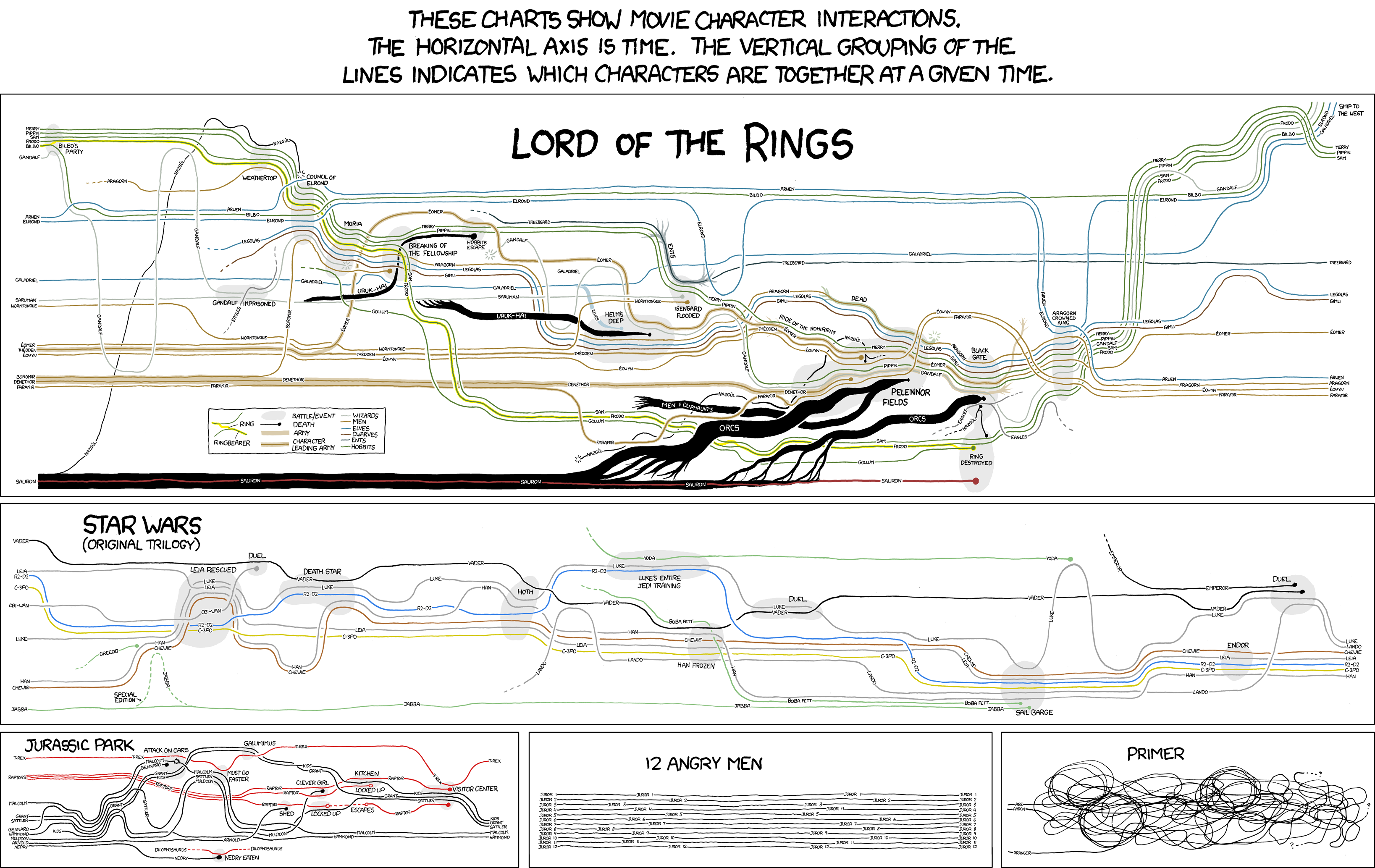
It is very information dense but I'm not sure you could take anything meaningful out of it quickly.
There's also this data viz of Napolean's army in a Russia campaign that Tufte made famous:
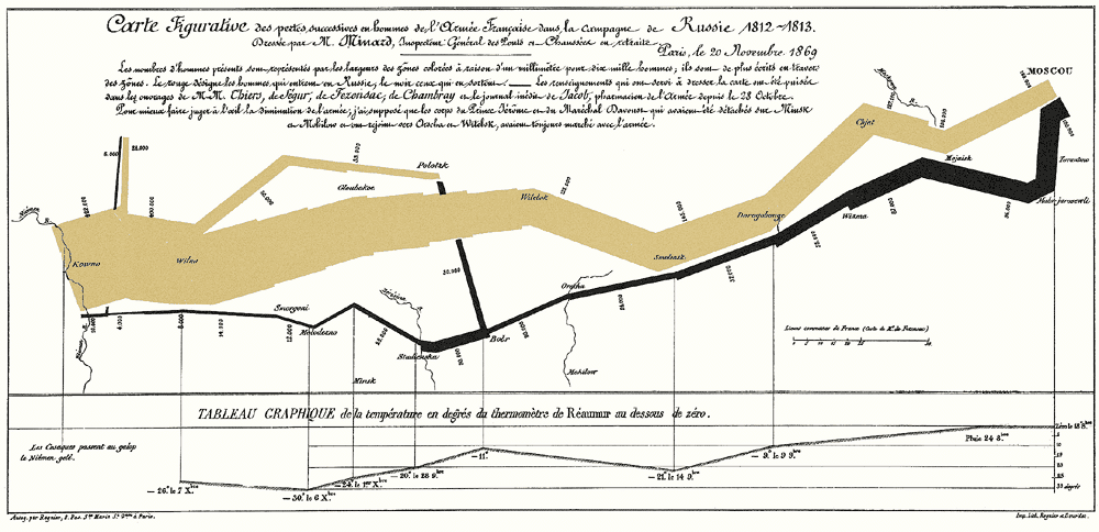
It contains the size of the army, the path, a time line and temperatures. It certainly is information dense. It also is certainly an improvement in terms of story and interactivity over a table of numbers. On the other hand, I wouldn't call it glanceable. I'd argue that the amount of glanceability should directly relate to how strongly you wish to communicate a specific message. Tara may have mentioned this but it was 8 a.m. on Monday morning so all my synapses weren't firing at full capacity.
Now, in my typical style, I will boost my word count by talking about something tangentially related!
For awhile now I've been interested in this idea of district and school dashboards. Stephen Few wrote a book with some nice examples, but business based. I'd love to do something like this, but less ugly. Every school and every district should be making our goals transparent and public. And before you freak out about reducing kids to data points and all that, notice the district is also tracking things like the percent of kids enrolled in extracurricular programs. Most districts keep this data. They just hide it or they don't aggregate it. A good data visualization can keep the important stuff front and center. Now if I could only get Tara down to San Jose.....
Takeaway: Data visualization can help the story come out. Keep purpose in mind and design accordingly.
Wrapping up on the notes. One more session to definitely blog (John Hattie!). Maybe two if I can pull enough out of my last session. Thanks for staying with me.
Wednesday, March 30, 2011
Session 6: Transforming the Early Childhood Classroom
I couldn't find the presenter's name in my notes. (Edit: Meghan Callahan. Thanks Jenny) I'll update the post when I find it.
I went because I wanted to see how the presenter integrated Patterns of Thinking in her class.
Main idea: Guided play is part of a rich learning experience.
Things I found interesting, but not necessarily that I agree with. My quick thoughts are in italics:
The presenter is a head start teacher. Her presentation was on a cycle of play so the notes will focus on what that cycle looked like.
For step one, she asked the students to make predictions about a firefighter visit. She prompted them to look and see if their predictions were correct and to notice what else the firefighters bring that we didn't predict.
When the firefighters came she had them engage in guided discovery. In addition to the previous prompt she asked them to walk around the fire engine and, "If you see something you're curious about, ask about it." The firefighters later commented that her students asked far more rich questions than other questions.
I always appreciate these kinds of loose structures. I know some people argue for open choice but it's paralyzing to have too many options. There's an example I've seen a few times where people are asked to, "Name things that are white." vs. "Name things that are in your refrigerator that are white." The second prompt generates more examples. This also relates to a point that Fisher brought up about cueing. How we perceive things is directly related to our level of expertise. I look at most art and can't tell the difference. I look at it but I don't really see art. If you said, "Pay attention to how the artist uses color to convey emotion," I would have a far richer experience.
The next section was probably a more typical school experience. Students discussed what they saw. Created labels and drawings and a concept web. They read related books. One point the teacher brought up is that students would often describe things in terms of function so she needed to stay persistent with using the vocabulary.
That's true for my 8th graders as well. I don't know how many times I've heard a triple beam balance described as "the mass thingy."
They then planned and built a fire truck. There was a lot of nice stuff here. They were practicing sorting and comparing sizes. Best of all they kept referring back to their plan.
At some point you probably asked, "Why is Jason going to watch an ECE presentation?" Well, here's another reason. My kids will create elaborate build or lab plans and then completely abandon them when the tools hit the table. Obviously it's something I need to reinforce.
Next came the guided play section. The main things that separated this from standard free play is that the teacher set the scenarios (Pretend you're going to the fire, then at the fire, then coming back) and that she was there to help extend them.
When my oldest daughter, who is the same age as the students in the videos, plays firefighter it looks like this: She's sleeping. The alarm rings and she gets up and runs to wherever this fire is. She sprays it with an imaginary hose for 3 seconds and then returns to the fire station and goes back to sleep. Repeat ad infinitum. If I were helping extend her play I might ask her, "What else would a firefighter do at a fire?" And yes, this is completely relevant to when students are conducting their own investigations.
Finally, they wrapped up the cycle with discussion and various literacy experiences. Again, focusing on part-whole relationships. The whole process took about 2 weeks.
Takeaway: The focus of the presentation was on guided play and integrating part-whole relationships into the standard curriculum. That was good. But for me I was struck by the false dichotomy that science teachers tend to put forth about process and content. This was a rich learning activity that focused on both process and content. It's not either/or. This teacher did both. The students learned about relationships, sorting, planning, and questioning. But they also practiced literacy and counting and learned the "facts." Content and process are not in competition. If you think you're going to teach one and not the other, you're not actually teaching either.
I admit I may have completely missed on this one. Novices experience things differently remember? I'm going to defer to Jenny here to catch me in my errors.
I went because I wanted to see how the presenter integrated Patterns of Thinking in her class.
Main idea: Guided play is part of a rich learning experience.
Things I found interesting, but not necessarily that I agree with. My quick thoughts are in italics:
The presenter is a head start teacher. Her presentation was on a cycle of play so the notes will focus on what that cycle looked like.
- Assess literacy skills and background knowledge. Provide relevant experiences and make connections to current topic.
- In a guided play session, give the play structure and occasionally step in to elaborate and move it forward.
- Connect the play experiences with topic discussion, focusing on roles, actions, and vocabulary.
For step one, she asked the students to make predictions about a firefighter visit. She prompted them to look and see if their predictions were correct and to notice what else the firefighters bring that we didn't predict.
When the firefighters came she had them engage in guided discovery. In addition to the previous prompt she asked them to walk around the fire engine and, "If you see something you're curious about, ask about it." The firefighters later commented that her students asked far more rich questions than other questions.
I always appreciate these kinds of loose structures. I know some people argue for open choice but it's paralyzing to have too many options. There's an example I've seen a few times where people are asked to, "Name things that are white." vs. "Name things that are in your refrigerator that are white." The second prompt generates more examples. This also relates to a point that Fisher brought up about cueing. How we perceive things is directly related to our level of expertise. I look at most art and can't tell the difference. I look at it but I don't really see art. If you said, "Pay attention to how the artist uses color to convey emotion," I would have a far richer experience.
The next section was probably a more typical school experience. Students discussed what they saw. Created labels and drawings and a concept web. They read related books. One point the teacher brought up is that students would often describe things in terms of function so she needed to stay persistent with using the vocabulary.
That's true for my 8th graders as well. I don't know how many times I've heard a triple beam balance described as "the mass thingy."
They then planned and built a fire truck. There was a lot of nice stuff here. They were practicing sorting and comparing sizes. Best of all they kept referring back to their plan.
At some point you probably asked, "Why is Jason going to watch an ECE presentation?" Well, here's another reason. My kids will create elaborate build or lab plans and then completely abandon them when the tools hit the table. Obviously it's something I need to reinforce.
Next came the guided play section. The main things that separated this from standard free play is that the teacher set the scenarios (Pretend you're going to the fire, then at the fire, then coming back) and that she was there to help extend them.
When my oldest daughter, who is the same age as the students in the videos, plays firefighter it looks like this: She's sleeping. The alarm rings and she gets up and runs to wherever this fire is. She sprays it with an imaginary hose for 3 seconds and then returns to the fire station and goes back to sleep. Repeat ad infinitum. If I were helping extend her play I might ask her, "What else would a firefighter do at a fire?" And yes, this is completely relevant to when students are conducting their own investigations.
Finally, they wrapped up the cycle with discussion and various literacy experiences. Again, focusing on part-whole relationships. The whole process took about 2 weeks.
Takeaway: The focus of the presentation was on guided play and integrating part-whole relationships into the standard curriculum. That was good. But for me I was struck by the false dichotomy that science teachers tend to put forth about process and content. This was a rich learning activity that focused on both process and content. It's not either/or. This teacher did both. The students learned about relationships, sorting, planning, and questioning. But they also practiced literacy and counting and learned the "facts." Content and process are not in competition. If you think you're going to teach one and not the other, you're not actually teaching either.
I admit I may have completely missed on this one. Novices experience things differently remember? I'm going to defer to Jenny here to catch me in my errors.
Subscribe to:
Posts (Atom)